Fussy Formatting
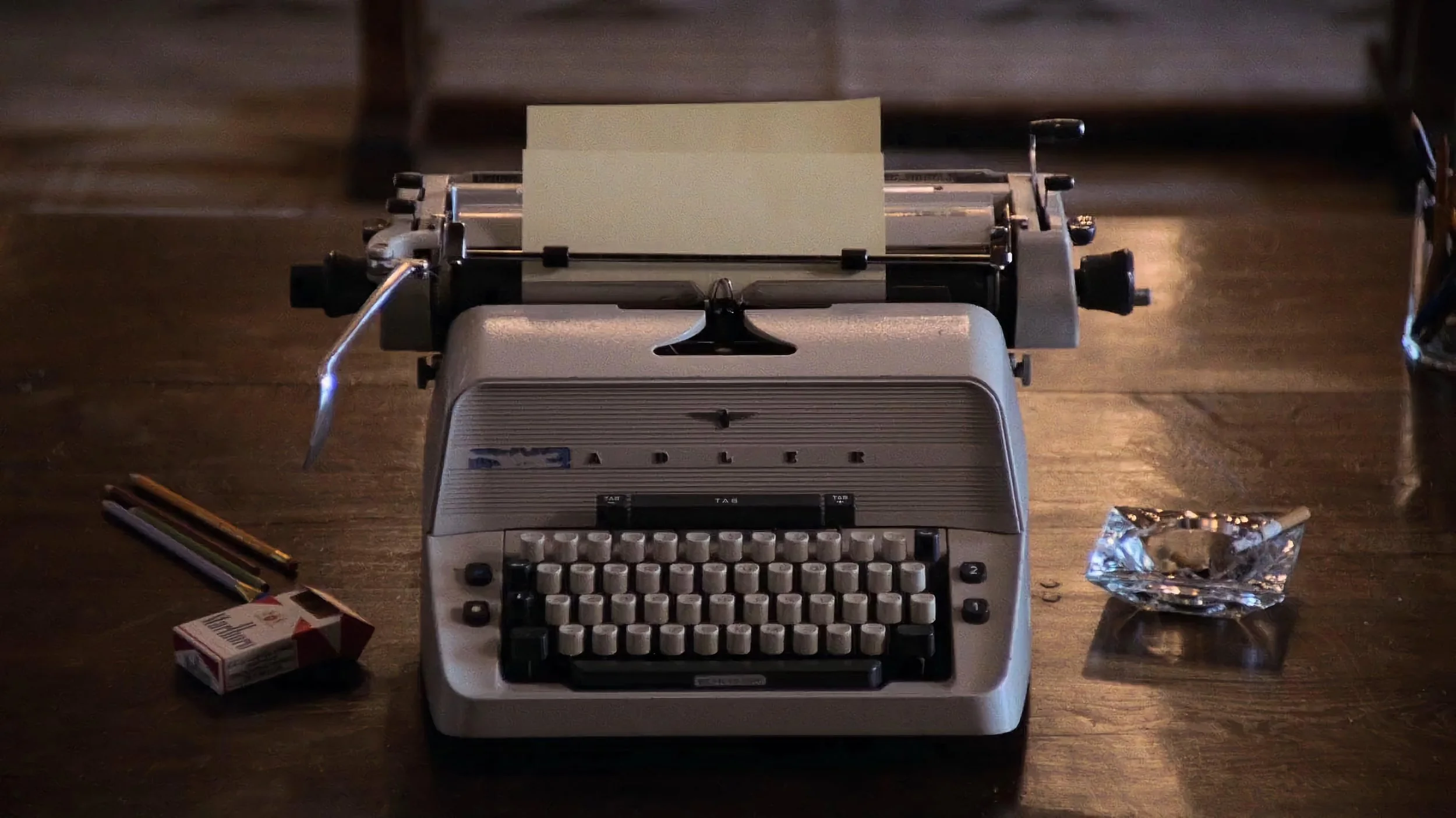
Publishers package manuscripts into a tangible products, something to attract the reader’s attention. The cover, the testimonials, and the blurb on the back epitomise this process. But, once the book’s been purchased, it’s the inside of the book – the feel of the paper, the sharpness and deep blacks of the printing, the space and formatting of the text – that affects the reading experience.
Prior to ebooks, the print quality of physical books seemed to be in decline. Quality, it appeared, had been sacrificed for cost savings. The typesetting squeezed the text by using smaller fonts, smaller line heights, narrow margins, and less space at the start of new chapters. All this was designed to reduce the number of pages. The tactile quality of physical books had gone down and, along with it, that luxurious reading experience.
And then ebooks arrived. Readers could change the text size and choose their own font. Physical books lost market share. Since then, publishers have reconsidered the physical book as a tangible object. The paper has improved. The printing has sharpened. Novels are generally formatted with more consideration for that luxurious reading experience (the kind previously associated with premium hardbacks). This is great news for readers, but there are some quirks, often created by writers, that cause frustration.
The first of these is dialogue formatting…. or the lack of formatting. In the UK we generally use single quotation marks:
‘The fox jumps over the lazy dog,’ he said.
It’s not perfect, but it does a good job of indicating clearly where the dialogue is without being too intrusive and cluttering the page. The US uses double quotation marks, which do look slightly more busy:
“The fox jumps over the lazy dog,” he said.
French has the guillemet (« ») for standard use and the em-dash for novels:
— The fox jumps over the lazy dog, he said.
There are many different versions of dialogue quotes. German has low-high double quotes („ “) or the inward pointing guillemet (» «). Japanese and Mandarin have corner brackets (「 」 and 『 』). This is fine. The problem is when there’s no dialogue identification. This can slow down the reader and cause confusion:
The fox jumps over the lazy dog, he said.
This trend originates from Modernist writers who wanted to break with tradition. It started with writer’s like James Joyce, which in turn influenced writer’s like Cormac McCarthy and, more recently, people like Tim Winton. Messing around with convention is fine for experimental work, but annoying for people who just want an easy read. After all, these conventions exist for a reason – they make the text more accessible.
Another thing that annoys me is spaces between paragraphs. Spaces between paragraphs are okay for a business document, an email or a webpage, but novels should have indented paragraphs. Peter Heller’s novel The Dog Stars is a great read, but why does it have spaces between the paragraphs, like it was formatted in Microsoft Word?
And, going back to Cormac McCarthy, why are there no chapter names or numbers? Chapter numbers are a helpful way for readers to gauge where they are in a novel. This isn’t being fussy. These details help to make novels more accessible, especially in an age where reading a novel is in direct competition with social media and streaming platforms.